

Truth in Labeling
Triptych Posters
This is a poster series addressing the deceit that goes into our food labels. The food item being addressed in these posters is eggs, specifically the living conditions of the chickens that create them and the misconception on the label. ‘Cage Free’, according to the USDA is that they are simply not in cages, but still never see sunlight and have less than one square foot of space between them. The USDA states that ‘Free Range’ means that they are allowed time outside but does not have a time requirement. It is solely up to those who who own the chickens with how much time they are allowed outside of an enclosure which gives them less than two square feet between them. ‘Open Pasture’ is not a term regulated by the USDA. The chickens are free to roam outside with access to an enclosure, grass to feed on, and more than 108 square feet for each chicken.

Beginning Stages
The first step when adapting these posters was determining what visuals I wanted to include to reflect the living conditions that these supposedly cage free and free range chickens live in. Showcasing their quality of life and what their USDA label is was what I rendered from these sketches.
First Iteration
The first draft was determining text placement and font choices. Finding images that were easily distinguishable between their living conditions was a challenge to find in higher quality print, but not impossible. Establishing a visual hierarchy was also something being determined at this time.


Second Iteration
With this stage, a visual hierarchy was established, along with typography and the placement of it. The tricky part was finding more appropriate images to reflect their conditions that were not blurred when blown up to a poster size.
With the typeface decision I want something that was bold and grabbed the viewers attention without taking away from legibility. When trying to get across an important message such as this, I did not want the viewer trying to read the print but for it to be easily noticed from a distance.
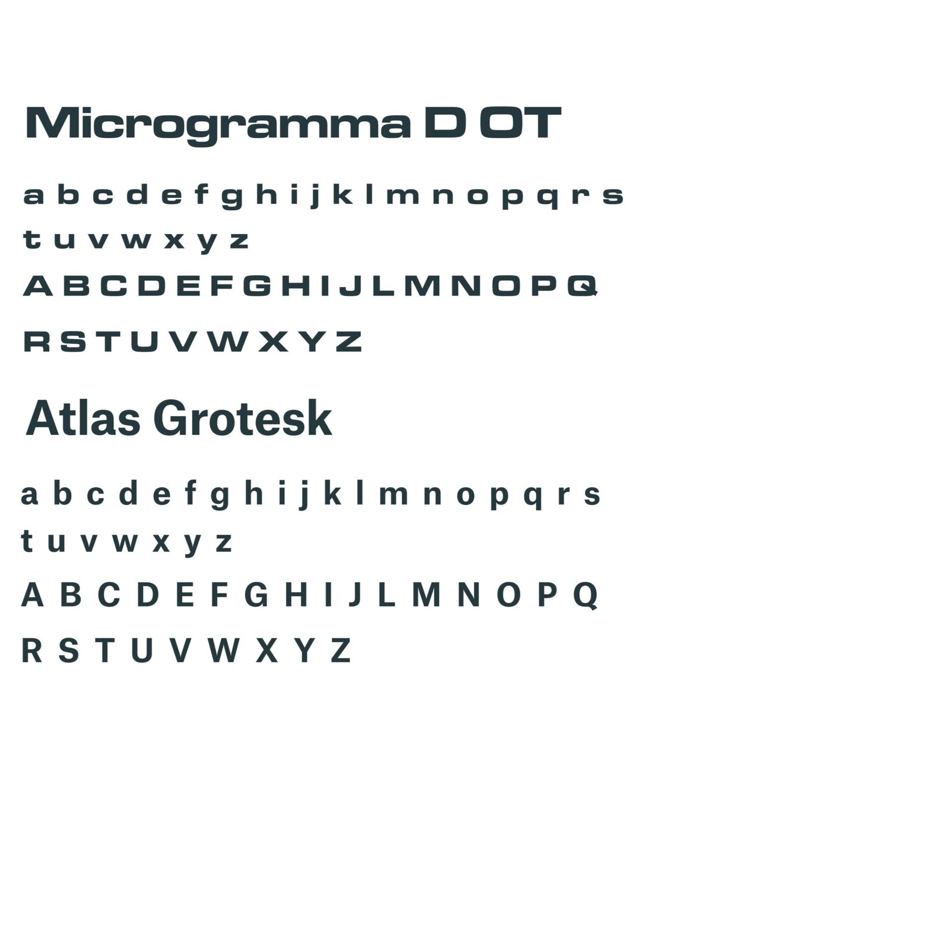
Typography

Colors
With how much is going on within the image, I did not want to distract with an overwhelming color palette. That is why I chose a simple gray and white to display in these posters.
The images I chose for these posters are intended to display the living conditions that these chickens actually live in that are more aesthetically pleasing and of higher quality compared to the ones before. What the USDA allows when they give the eggs the titles that they do, it’s very deceitful. Pasture Raised is what people think they are buying when purchasing the other two and these posters are meant to highlight those crucial differences.

Final Draft


