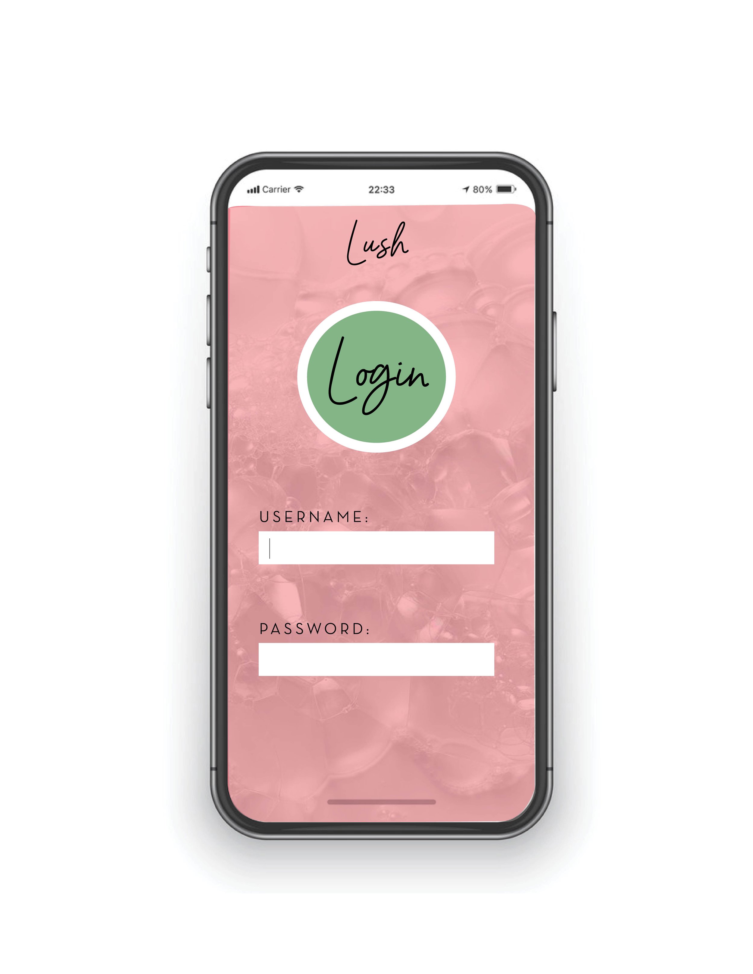
LUSH Cosmetic Rebrand
This is a company rebrand for LUSH Cosmetic Company. Since it is a natural brand I wanted to incorporate plants into the revised logo and use a looser appearing font to better match the company’s style.
Original Logo
The original logo is very structured and understates the style of the company and what they stand for. Lush Cosmetics 100% natural, cruelty free and creates bright, fun products for their consumers to enjoy. I did not think any of those qualities are reflected in their current logo and wanted to make some changes.

Final Logo
Their original logo seemed too structured and rigid considering their brand is all about being organic, eco-friendly, and having a fun line of cosmetic products.

First Logo Concept

Second Logo Concept
Beginning Stage
When conceptualizing the first and second logo concepts I was determining a color palette and wanted the viewer to know that it was a selfcare and cosmetic company. Including the line drawing of the woman with hands framing her face was intended to reflect that LUSH was there to take care of you. I wanted to include natural elements such as plants and couldn’t organically do that with the included face.

Typography
I chose Barcelony as my looser font because I enjoyed the visual flow of its appearance and better represented the company. Neutra Display was chosen to balance out the eye catching cursive font with something simpler and structured.

Colors
I chose these colors because I wanted the branding to appear natural and bright. With it being a cruelty free cosmetic company I wanted the colors to encapsulate that.
The final logo includes structured elements like the box and a sans-serif font displaying ‘Fresh Handmade Cosmetics’ paired alongside the bold, swirled Lush name with plant elements that are similar in style to the cursive. I wanted the logo to be simple but interesting.

Final Logo
Branding Suite


Environmental Contact